• PORTFOLIOS
  • Prints
  • Licensing
  • Books
  • About
  • CONTACT
  • Blog
  • Instagram
  • LINKS
  • TECH INFO
Menu

William Karl Valentine

  • PORTFOLIOS
  • Prints
  • Licensing
  • Books
  • About
  • CONTACT
  • Blog
  • Instagram
  • LINKS
  • TECH INFO
Liz Allen working on her “hand” print for the book

Liz Allen working on her “hand” print for the book

Interactive component of the Qualities of LIGHT exhibition at the CCP

March 4, 2020

An important component of the Qualities of LIGHT exhibition is the interactive element. I focused on it some in my initial post about the opening. Since there was more activity during the symposium I documented it and felt it worked best to highlight it again in a separate post.

View fullsize Camilla Stevenson
View fullsize Web 1-17 to 19-20 CCP - 4 Legacies of LIGHT 6.jpg
View fullsize Web 1-17 to 19-20 CCP - 4 Legacies of LIGHT 7.jpg
View fullsize David Ragland
View fullsize Web 1-17 to 19-20 CCP - 5 Legacies of LIGHT 5.jpg
View fullsize Web 1-17 to 19-20 CCP - 5 Legacies of LIGHT 6.jpg
View fullsize Web 1-17 to 19-20 CCP - 5 Legacies of LIGHT 7.jpg

So again there were basically three interactive elements people could do. First was someone could have their photograph taken at a replica of Harold Jone’s LIGHT gallery desk by CCP’s David Ragland. Next you could sketch your hand to create a drawing to be bound in a book at the conclusion of the exhibition. LIGHT gallery did this at one point and the CCP was recreating that. CCP’s Camilla Stevenson was in charge of getting people to participate with this at the symposium and added a component by taking instant photographs of people to be included in the book with their hand sketches. I pushed the envelope with my sketch using my left had to sketch my right hand (most hand sketches were of left hands), then I had Camilla sign the instant print she took of me so she could lay claim to having a print in the exhibition then . The final station was where you could draw your own personal line map connecting yourself back to LIGHT gallery. I had completed my line map in December and after the symposium I could have added a lot more connections. I brought home a blank sheet so I will probably eventually update a copy for myself. All completed maps were pinned to the back wall of the interactive space to be shared. All three elements were fun and I especially loved the process of the line map.

In Museums, Photography, Galleries Tags #Light2020, The Center for Creative Photography, LIGHT gallery, Becky Senf, William Karl Valentine, Tucson, Arizona, Adam Monohon
Comment
Marvin Heiferman and Laurence Miller recreate their photograph from LIGHT gallery 1/19/20

Marvin Heiferman and Laurence Miller recreate their photograph from LIGHT gallery 1/19/20

Marvin Heiferman & Laurence Miller - The Qualities of LIGHT

March 4, 2020

I thought this moment was worth a separate blog post so it didn’t get lost in the larger body of post on the symposium.

On Sunday when there was a break before the final event I wandered around the gallery, which was mostly empty, and was rewarded for it. I already wrote a specific post on meeting Fern Schad which was fantastic. I was also able to photograph Alec Soth talking to Rick Wester about prints in the exhibition. Then I noticed Laurence Miller and Marvin Heiferman preparing to recreate the photo of them when they both were at LIGHT. Emily Una Weirich from CCP was getting a stool for Marvin to sit on and Dr. Maurice Berger was preparing to use his iPhone to photograph it. I saw the opportunity to photograph again so I took it.

For me I am very interested in the use of the cell phone in today’s world. I often look for phone use in my street photography and probably already have a solid body of work documenting phone use. I look for folks photographing with cellphones then see what I can compose. So not only did I capture the image above but I also photographed the photographer. One side note that I found interesting at the symposium was I one of the few people using a camera to document the event. Granted it was a small Sony RX100 vi , it still has a one inch sensor and is a camera. Everyone else seemed to just be using their cellphones to take an occasional photograph. This I found really odd because the lobby of CCP had large proof sheets of images from the parties and openings at LIGHT and it was obvious they used to document and photograph each other all the time. I am thankful they didn’t mind me intruding on their moment to document it.

Dr. Maurice Berger photographing Marvin Heiferman and Laurence Miller

Dr. Maurice Berger photographing Marvin Heiferman and Laurence Miller

View fullsize Web 1-17 to 19-20 CCP - 4 Legacies of LIGHT 11.jpg
View fullsize Web 1-17 to 19-20 CCP - 4 Legacies of LIGHT 12.jpg


In Photography, Galleries, Museums Tags Laurence Miller Gallery, Marvin Heiferman, Dr. Maurice Berger, Emily Una Weirich, #Light2020, The Center for Creative Photography, The University of Arizona, Tucson, Arizona, William Karl Valentine
Comment
William Karl Valentine and Fern Schad - The Qualities of LIGHT exhibition at the CCP - Tucson, AZ 1/19/20

William Karl Valentine and Fern Schad - The Qualities of LIGHT exhibition at the CCP - Tucson, AZ 1/19/20

Fern Schad - Legacies of LIGHT at the CCP

March 3, 2020

I must admit something, before the inclusion of my print in the Qualities of LIGHT exhibition I didn’t know who Fern Schad was.  I graduated from ASU in 1986 just before LIGHT closed so they were still an active gallery and most my history of photography lessons had been about photographers not galleries or institutions.

At the Legacies of LIGHT symposium at the Center for Creative Photography, I quickly learned who Fern was and what an important role she played in helping to establish Photography as an accepted medium of art.  I detailed the experiences of the symposium in a separate blog post, but I wanted to do a separate post on Fern to highlight some things.

First, I truly enjoyed listening to her describe LIGHT, the time period in New York City, and her experiences.  She is a great presenter.

On Sunday after the last panel session concluded there was a break before the concluding celebration of Harold Jones and his work.  Most people were interacting in the lobby but luckily I went back in to the gallery to look around again. 

I found Fern walking through the main gallery alone looking at the photographs of the LIGHT artists.  I watched her as she spent time with each image and tried to imagine all she was recounting, not only about the images but of that period of her life.  I stayed back and took several photographs hesitating for her to between walls before interrupting her.

View fullsize Web 1-17 to 19-20 CCP - 4 Legacies of LIGHT 27.jpg
View fullsize Web 1-17 to 19-20 CCP - 4 Legacies of LIGHT 26.jpg

I introduced myself, and explained I had studied under Bill Jay at ASU because she had spoken about working for Bill Jay.  I asked her about what it felt like being in this space and she spoke briefly about her memories.  I then thanked her for LIGHT and explained how the ripple effect of LIGHT was still continuing because I had a print in the Emerging Artists flat file component of the exhibition.  She was very gracious and asked to see my print.  It was a very powerful moment for me to watch Fern holding my print, studying it, and then talking with me about it.  Receiving validation from someone with her expertise and experience meant a lot to me considering how many important prints she has handled in her lifetime.  I am thankful that I thought to photograph her holding the print because the moment is important to me.  Having this print in the exhibition and later having it added to the permanent collection of the CCP is important for my career.  I only spent a few minutes with Fern but the experience will be one of the more memorable ones in my photography career.

Fern Schad viewing William Karl Valentine’s print which is included in “The Qualities of LIGHT: exhibition flat file drawers” at the Center for Creative Photography - University of Arizona.

Fern Schad viewing William Karl Valentine’s print which is included in “The Qualities of LIGHT: exhibition flat file drawers” at the Center for Creative Photography - University of Arizona.

When I returned home from Tucson I wanted to learn more about Fern.  I found she remarried Alfred H. Moses after Tennyson passed and that their Alfred H. Moses and Fern M. Schad Fund has sponsored numerous major photography exhibitions, some of which I have seen.   More photographers should know about Fern and her contributions to the medium, I am so lucky I was able to get to meet her and learn of her impact.

In Photography, Galleries, Museums Tags Fern SChad, Tennyson Schad, The Center for Creative Photography, #light2020, #qualitiesoflight, LIGHT gallery, New York, Photography, Alfred H. Moses and Fern M. Schad Fund, Bill Jay, #Light2020, #LIGHT2020
Comment
Installing the exhibition - push pins, level, tape measure, and “eyeballing it” 1/24/20

Installing the exhibition - push pins, level, tape measure, and “eyeballing it” 1/24/20

William Karl Valentine - Exhibition at SAMYS - Pasadena, California

March 3, 2020

I drove the 500 miles home from Tucson on Sunday afternoon after everything with the Legacies of LIGHT symposium wrapped up.  The next day I headed to Pasadena to check in on my mom and run some errands.

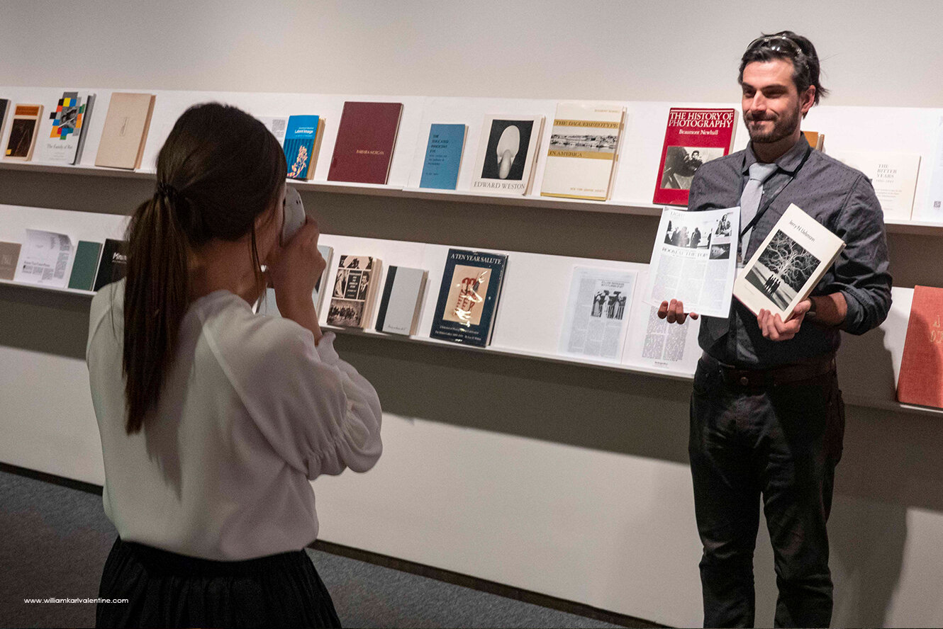
I stopped in at Samys Camera to get a couple things and to tell my friends there about the experience I had at the symposium.  While talking with Jeff O’Brien he told me how the prints on the store’s small gallery wall had been up almost three months and he wanted to get some new photos up.  He knows my work well and asked me to come up with something.  I immediately agreed and started thinking about what I would do.

This reason I am going in to so much detail with this blog post is I want to give the reader insight into my thought process and approach to a simple exhibit so they can better understand approach to photography.

I realize the back wall of a camera store is not necessarily prestigious but in this case it had a lot of value.  First of all the wall is very prominent and accessible.  Almost every customer sees the wall when the exit the store and any customer going to the rental department walks right by it.  This store has lots of knowledgeable photographers who are customers, plus it is two block away from a Pasadena City College which has an outstanding photography department.  So the volume of potential viewers is very good. 

I grew up in Pasadena and went to Pasadena City College, for me there was sentimental value to go home again.  I had also exhibited work at Flags Photo (camera store) in Pasadena during the 1990’s, the store Jeff’s father had owned.  I know that most any opportunity to showcase your work is a good thing because you never know who may see your images.  I also know the process of editing and presenting an exhibition is a great exercise for a photographer.

When it came to what images to show I knew I had to include the image from my Pasadena PD series which was in the CCP’s Qualities of LIGHT exhibition, but I didn’t want to only showcase images from that series because they are from 34 years ago.  I knew I wanted to give an overview of my work when I started editing for it, was thinking a linear display at first, and wanted to highlight images which had been in prominent exhibitions or were in permanent collections.  I also had only glanced at the wall, had a guess at the size, but I hadn’t measured it.

Because I wanted to turn the project quickly I decided to make prints specifically for the show and didn’t want to deal with framing them.  Michal Raz Russo’s presentation at the Legacies of LIGHT about some of the LIGHT gallery’s installations was fresh in my mind, so I started thinking about a simple way to the present work.  The more I thought about it I realized I wanted to avoid a single straight row of prints and that I wanted to break up the pace of the images visually.  I decided to make digital prints that were all consistent with each other even if the images were from film.  I just can’t bring myself to casually display good silver gelatin prints since it takes so long to make them.

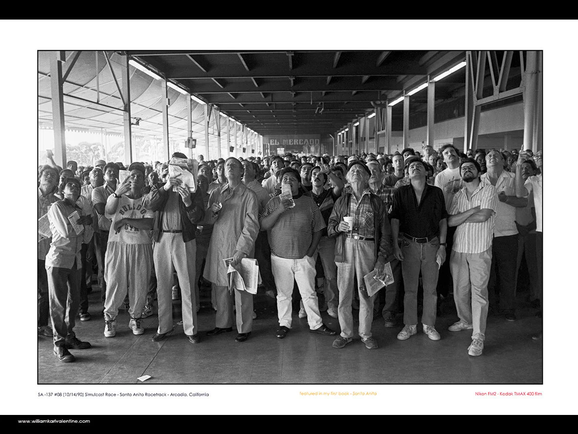
I started going through my image files thinking about which other images would fit.  Lee Baroni applying the Carotid hold on the Duster jumped out as a good companion to the CCP image.  The photo of Lee is in the permanent collection at the University of New Mexico.  The Photograph of the motorcade from Officer Russ Miller’s funeral was another obvious choice.  It was featured in the Billboard Creative in Los Angeles a couple years ago and is a signature image.  “The Killing Fields” image is in the permanent collection of the Fogg Museum at Harvard, plus it represented my Rio Hondo Police Academy series well.  I chose the “Simulcast Race” image from my Santa Anita book because it is one of my favorites.  I also wasn’t looking to inspire any more debate over the horseracing industry which an actual horse related image might do.  I chose the photo of the Giants coaches to represent my Cactus League series because it really captured how pure spring training used to be.  In today’s world I would never be able to access to stand in that position to capture that exposure.  I liked the Mariano Rivera image to represent my Wrigley-Fenway-Tiger series because it would help transition well into my street photography images.  An interesting side note had never printed the image as large as I did for this exhibition and when I did I found new and exciting details in the image I had not seen in the 23 years since I had made the exposure.  The view of the World Trade Center from the Empire State Building was another obvious image and one I have wanted to show more.

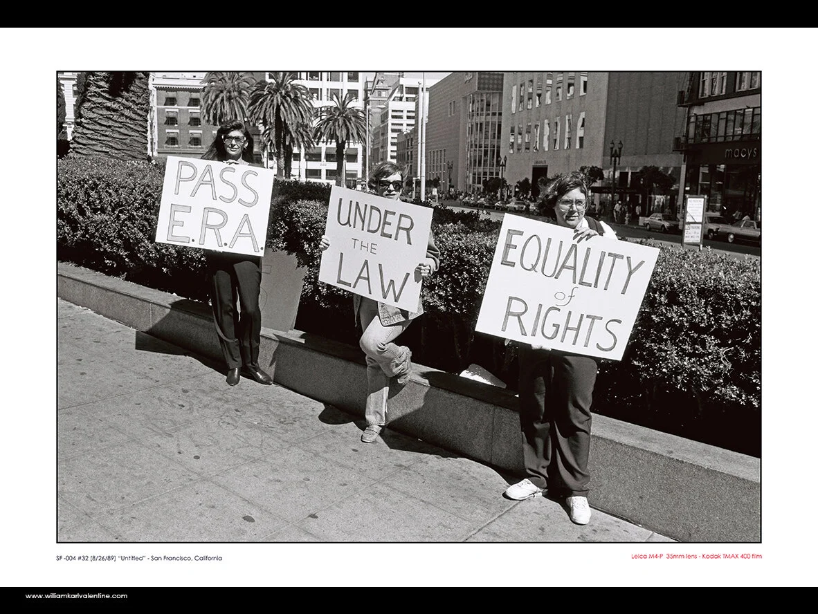
After selecting those 8 images I figured I probably had enough images but decided to choose more images so I would have options in my wall design since I was going to figure things out as I installed it.  The ASU pool party image was a good representation of my Alphaville series and I came across a scan of ERA activists from San Francisco in 1989 which really jumped out at me.  I have become so tired of today’s world with people who have differing opinions screaming at one another and thinking they are properly applying their 1st Amendment Rights.  After these choices I selected five recent images that I keep returning to.  I wanted to have images from Chicago, New York, and Newport Beach in the show if I could.  One image was in color from the 4th of July and I didn’t think it would fit but I decided to print it and just see if there was a place for it.

View fullsize WKV Samys 2020 exhibit 11.jpg
View fullsize WKV Samys 2020 exhibit 8.jpg
View fullsize WKV Samys 2020 exhibit 10.jpg
View fullsize WKV Samys 2020 exhibit 9.jpg
View fullsize WKV Samys 2020 exhibit 12.jpg

Since the prints were just for this exhibition I added text to the prints below the image so I wouldn’t have to deal with identification labels. I put the image information and because they were on display in a camera store I also added information about the camera I used and the film type for the older images.  I also listed information if the image was in a permanent collection or had been in a recent prominent exhibition.  After making the 15 different prints I made a single 8.5 x 11 print with all the images on it in a rough design which I thought might work.  Actually I thought the first four rows would be as they were and the last row was just a reference point of the images, that I would only use a couple of them maybe.

The reference sheet I used while designing installation of the exhibition.

The reference sheet I used while designing installation of the exhibition.

I wrote the artist statement specifically for this exhibition with the primary focus being my connection to Pasadena.  Realizing many viewers would be passing by quickly I used bold font to highlight key points so the statement could be quickly scanned.  Because I am always trying to increase the exposure of my work I created several QR codes with links to my Instagram and website then created an information page for people who wanted to learn more about my work.  I also created a smaller page with a QR code link for the Qualities of LIGHT exhibition.

WKV+Samys+2020+exhibit+5a.jpg

I decided to pin the images to the wall, because it was a quick and secure way to install the show plus it would do minimal damage to the wall.  I also liked the look and feel of presenting that way, but I knew I needed to have metal push pins for it to be right.  I thought the idea of the pins was a simple one until it came time to buy them.  I literally had to go to four stores to finally get enough pins for the exhibition, thank God for Office Depot still carrying them.

I began the installation process with a tape measure, note pad, and math.  I also realized the angle of the floor next to the wall was greater than I remembered since it really a ramp allowing handicap access to the store and easy carryout for large amounts of rental equipment.  So obviously the sight line of the space changes and I had to take that in to account. 

View fullsize WKV Samys 2020 exhibit 6.jpg
View fullsize WKV Samys 2020 exhibit 7.jpg
View fullsize WKV Samys 2020 exhibit 3.jpg
View fullsize WKV Samys 2020 exhibit 7A.jpg

I always remember from my Northlight days at ASU that the center line of artwork should be like 56” from the floor.  I know I am 6’5” and that I like a higher center point, plus I realized the way the store was configured I wanted to have at least some of the prints high enough to be seen above the displays to draw viewers in.  Using blue painters tape I marked the center line from the floor up.  I taped up a couple test prints and I had my friend who is much shorter than I am go along the wall to find what her eye level was.  From that point I went by feel and judgement to adjust the center line and then kept it fairly consistent to the floor by measuring for each new row of prints. 

I found that double stacking two vertical images made them too hard to view so I adjusted the Pasadena PD images to go side by side.  I decided to pin the prints keeping a 3” gap between all prints.  I also used my level with a built-in ruler to keep things accurate.  I then kept putting up prints, designing as I went.  I had the one-color print left over, but I soon found a place for it. The next section of the wall surface changed, and it had a large framed color print on it which was is a permanent thing but lots of blank wall before it.  So, I found a home for the 15th print.

I know this is a relatively long blog post on a simple thing but I thought some readers may find value with the insight in to my process.


This Samys Camera store is located at 1759 E. Colorado Boulevard in Pasadena, California and is open daily 8am to 6pm.  I am not sure how long the exhibition will be up, most likely through the end of March. 

William Karl Valentine

William Karl Valentine


In Galleries, Photography Tags William Karl Valentine, The Center for Creative Photography, Pasadena, Pasadena Police Department, Pasadena City College, Michal Raz Russo, Fogg Museum, LIGHT gallery, #light2020, Samys camera
Comment
Mark Klett speaking with guests at the Land Re-Form opening - Etherton Gallery, Tucson, Arizona 1/18/20

Mark Klett speaking with guests at the Land Re-Form opening - Etherton Gallery, Tucson, Arizona 1/18/20

Etherton Gallery - Opening of Land Re-Form - Tucson, Arizona

March 3, 2020

While I was at the Legacies of Light Symposium in Tucson, the Etherton Gallery coordinated to have the opening of their current exhibition Land Re-Form on Saturday night after the symposium events were done. Land Re-Form features the work of Michael Berman, Frank Gohlke, and Mark Klett.

The best way to enjoy seeing the work in this exhibition on line is to follow the link above, Etherton’s website has so much outstanding content on their artists and their exhibitions.

Owner Terry Etherton has fantastic vision and has built a perfect gallery space in downtown Tucson. His roster of artists rivals the best galleries on either coast, and its also impressive that his gallery is now almost 40 years old.

I have long been familiar with the work of all three of these featured photographers, and Mark Klett was already at Arizona State University when I studied there so we know one another. All three produce beautiful prints and the design of the exhibition is a perfect pairing of their work.

Frank Gohlke’s Mount St. Helens prints.

Frank Gohlke’s Mount St. Helens prints.

I have long enjoyed Frank Gohlke’s work, his prints are so beautiful. I was glad I was able to spend time with him at the opening talking about his printing. Seeing great prints always motivates me to produce work, nothing like spending time seeing a perfect print. There is no one more gracious than Frank, I was lucky to be able to chat with him at the symposium too.

William Karl Valentine and Frank Gohlke - Etherton Gallery Opening - Tucson, Arizona 1/18/20

William Karl Valentine and Frank Gohlke - Etherton Gallery Opening - Tucson, Arizona 1/18/20

I also picked up two of Frank’s books at the opening, “Mount St. Helens” and “Landscape as Longing: Queens, New York” which he collaborated with Joel Sternfeld and Suketu Mehta.

Other work was also on display in the smaller rooms within the gallery. Just a fantastic variety of iconic images by masters and newer cutting edge work. If you are ever near Tucson, the Etherton Gallery is a must see.

View fullsize Web 1-18-20 Etherton 1.jpg
View fullsize Web 1-18-20 Etherton 2.jpg
View fullsize Web 1-18-20 Etherton 8.jpg
View fullsize Web 1-18-20 Etherton 7.jpg
View fullsize Web 1-18-20 Etherton 9.jpg
View fullsize Web 1-18-20 Etherton 5.jpg
View fullsize Web 1-18-20 Etherton 6.jpg
View fullsize Web 1-18-20 Etherton 13.jpg
In Galleries, Photography Tags Etherton Gallery, Tucs, Arizona, Mark Klett, Frank Gohlke, Terry Etherton, #light2020
Comment
William Karl Valentine at PHOTO LA 2020 - Barker Hanger, Santa Monica, California 2-2-20

William Karl Valentine at PHOTO LA 2020 - Barker Hanger, Santa Monica, California 2-2-20

PHOTO LA 2020

March 3, 2020

Even though 2020 has been a hectic year, I was still able to make it out to PHOTO LA this year. I definitely saw some great photographs there, and even better still I found lots of images to photograph myself. I have been writing volumes for this blog the last few days so I will keep this post simple, and for the most part let my photographs do the talking with the exception of one image.

William Karl Valentine with Mel Etherton by Danny Lyon print - Photo LA 2020 - Santa Monica CA 2-2-20

William Karl Valentine with Mel Etherton by Danny Lyon print - Photo LA 2020 - Santa Monica CA 2-2-20

I met Mel in Tucson in January when I was out for the Legacies of LIGHT symposium in Tucson. Her Husband, Terry, founded Etherton Gallery and I am featuring the gallery in another post here in my blog. To be specific I actually met Mel in Mary Virginia Swanson’s kitchen at a party after the symposium Sunday afternoon as someone was photographing her hair (true story, cool party). Anyways, at PHOTO LA I see Mel at the Etherton Gallery booth and I start a conversation with her, eventually asking her which print is her favorite. Without hesitation she pointed to this Danny Lyon print behind us in the photo , a photograph which is one of my favorites. After we talked about how great Danny’s work is she explained her connection to this particular image. She said they were at a Paris Photo LA event in 2014 when Brad Pitt came by their gallery space which was featuring Danny Lyon. She said Terry was busy with a client or off somewhere conducting business so she talked to Brad and basically sold him the print. The sale of the print made several news outlets and she got to tease Terry about it after that she was the one who closed the deal with Brad Pitt. Epic story, so happy she shared that with me.

So as for the rest of the PHOTO LA 2020 Experience I am just going to post a gallery and let the reader plow through some images.

View fullsize web PHOTO LA - CA DSC 04581  2-2-20.jpg
View fullsize web PHOTO LA - CA DSC 04586  2-2-20.jpg
View fullsize web PHOTO LA - CA DSC 04589  2-2-20.jpg
View fullsize web PHOTO LA - CA DSC 04600  2-2-20.jpg
View fullsize web PHOTO LA - CA DSC 04602  2-2-20.jpg
View fullsize web PHOTO LA - CA DSC 04605  2-2-20.jpg
View fullsize web PHOTO LA - CA DSC 04606  2-2-20.jpg
View fullsize web PHOTO LA - CA DSC 04609  2-2-20.jpg
View fullsize web PHOTO LA - CA DSC 04610  2-2-20.jpg
View fullsize web PHOTO LA - CA DSC 04618  2-2-20.jpg
View fullsize web PHOTO LA - CA DSC 04620  2-2-20.jpg
View fullsize web PHOTO LA - CA DSC 04627  2-2-20.jpg
View fullsize web PHOTO LA - CA DSC 04628  2-2-20.jpg
View fullsize web PHOTO LA - CA DSC 04631  2-2-20.jpg
View fullsize web PHOTO LA - CA DSC 04637  2-2-20.jpg
View fullsize web PHOTO LA - CA DSC 04638  2-2-20.jpg
View fullsize web PHOTO LA - CA DSC 04640  2-2-20.jpg
View fullsize web PHOTO LA - CA DSC 04642  2-2-20.jpg
View fullsize web PHOTO LA - CA DSC 04663  2-2-20.jpg
View fullsize web PHOTO LA - CA DSC 04669  2-2-20.jpg
View fullsize web PHOTO LA - CA DSC 04674  2-2-20.jpg
In Photography, Galleries Tags Photo LA, Los Angeles, Santa Monica, Documentary Photography, William Karl Valentine, Etherton Gallery, @photolafair, Brad Pitt
Comment
Dr. Rebecca Senf - Chief Curator at the Center for Creative Photography and the Norton Family Curator of Photography and photographer William Karl Valentine

Dr. Rebecca Senf - Chief Curator at the Center for Creative Photography and the Norton Family Curator of Photography and photographer William Karl Valentine

Qualities of LIGHT Exhibition - Center for Creative Photography OPENING

January 15, 2020

On December 13th I drove out to Tucson for the opening of The Qualities of LIGHT Exhibition at the Center for Creative Photography at the University of Arizona.

In my previous blog post I spoke about having a print selected to be included in this exhibition and I wrote about the history of that image. I also spoke about the concept for the exhibition which is to show the importance of The LIGHT Gallery and its impact on the development of Photography as an accepted art form. The CCP exhibition does a fantastic job capturing the spirit of the LIGHT Gallery and documenting LIGHT’s history. One thing LIGHT was famous for was showcasing work from emerging photographers. My print was included in this exhibition as an emerging photographer. My print, along with 120 other prints from other emerging photographers, is on display in one of four large flat files in the middle of the gallery. The concept is that people who view the exhibition can explore the drawers and make their own discoveries. There is also an interactive area where visitors can map their own association with the LIGHT Gallery or others who were influenced by LIGHT. There are also a number of historic artifacts from LIGHT to help recreate the gallery atmosphere.

View fullsize web AZ IMG 2661  12-18-19 CCP - Qualities of Light.jpg
View fullsize web AZ IMG 2678 12-18-19 CCP - Qualities of LIGHT  .jpg
View fullsize web AZ IMG 2683 12-18-19 CCP - Qualities of LIGHT .jpg
View fullsize web AZ DSC 1250 12-18-19 CCP - Qualities of LIGHT  .jpg
View fullsize web AZ DSC 1257 12-18-19 CCP - Qualities of LIGHT  .jpg
View fullsize web AZ DSC 1258 12-18-19 CCP - Qualities of LIGHT  .jpg
View fullsize web AZ DSC 1259 12-18-19 CCP - Qualities of LIGHT  .jpg
View fullsize web AZ DSC 1260 12-18-19 CCP - Qualities of LIGHT  .jpg
View fullsize web AZ DSC 1268 12-18-19 CCP - Qualities of LIGHT Becky Senf  .jpg
View fullsize web AZ IMG 2671  12-18-19 CCP - Qualities of LIGHT.jpg
View fullsize web AZ DSC 1240 12-18-19 CCP - Qualities of LIGHT  .jpg
View fullsize web AZ IMG 2670  12-18-19 CCP - Qualities of LIGHT.jpg
View fullsize web AZ DSC 1247  12-18-19 CCP - Qualities of LIGH.jpg
View fullsize web AZ IMG 2693  12-18-19 CCP - Qualities of LIGHT.jpg
View fullsize web AZ IMG 2706  12-18-19 CCP - Qualities of LIGHT.jpg
View fullsize web AZ IMG 2707 12-18-19 CCP - Qualities of LIGHT.jpg
View fullsize web AZ IMG 2667  12-18-19 CCP - Qualities of Light.jpg
View fullsize web AZ IMG 2699  12-18-19 CCP - Qualities of LIGHT.jpg
View fullsize web AZ IMG 2668  12-18-19 CCP - Qualities of LIGHT.jpg
View fullsize web AZ IMG 2666  12-18-19 CCP - Qualities of LIGHT.jpg

Below is my print and the accompanying artist statement information. This is a digital print from a negative scan which is archivally mounted.

View fullsize Meg Hagyard -CCP Senior Director for External Relations, Arts, Culture & Heritage
View fullsize web AZ DSC 1275  12-18-19 CCP - Qualities of LIGHT.jpg
View fullsize web AZ DSC 1277 12-18-19 CCP - Qualities of LIGHT William Karl Valentine.jpg
View fullsize web AZ IMG 2690  12-18-19 CCP - Qualities of LIGHT.jpg
View fullsize web AZ IMG 2691  12-18-19 CCP - Qualities of LIGHT.jpg
View fullsize web AZ IMG 2692  12-18-19 CCP - Qualities of LIGHT.jpg

CCP Director Anne Breckenridge Barrett and CCP Chief Curator Dr. Rebecca Senf speak at the Members opening of the exhibition. I also got meet CCP Curatorial Assistant Adam Monohon and CCP Archivist Emily Una Weirich. Everyone I met was fantastic and I am looking forward seeing them again at this weekend’s sold out LIGHT symposium.

View fullsize Anne Breckenridge Barrett - Director CCP
View fullsize Becky Senf - Chief Curator CCP
View fullsize Anne Breckenridge Barrett and Curatorial Assistant Adam Monohon
View fullsize Emily Una Weirich - Associate Archivist for Digital Initiatives

In my previous post I mentioned how this was the first time one of my prints has been in an exhibition with a WInogrand print, and how special that was for me. Below is the Winogrand print, a classic image from Women are Beautiful.

Garry Winogrand print form his Women are Beautiful series - 1968 New York

Garry Winogrand print form his Women are Beautiful series - 1968 New York

In Museums, Galleries, Photography Tags William Karl Valentine, Garry Winogrand, The Center for Creative Photography, Tucson, Arizona, The Qualities of LIGHT, Anne Breckenridge Barrett, Adam Monohon, Emily Una Weirich, Meg Hagyard
Comment
Pasadena PD Officers Naum Ware & Darin Craddolph conducting a search warrant related to rock cocaine sales. March 1987 (PPD-177 #23)

Pasadena PD Officers Naum Ware & Darin Craddolph conducting a search warrant related to rock cocaine sales. March 1987 (PPD-177 #23)

Qualities of LIGHT Exhibition - Center for Creative Photography

January 14, 2020

I am proud to announce that a print of the above image has been included in the Center for Creative Photography’s Qualities of LIGHT Exhibition which opened December 13th and runs through the end of May 2020.

This image is from my Pasadena Police Department Series which is one of my most important bodies of work. I began the series while studying at Arizona State University and exhibited the work at the Northlight Gallery just before I graduated. The ASU faculty arranged for Van Deren Coke, at the time the Director of The San Francisco Museum of Modern Art’s Photography Department, to meet with me privately in the gallery to review my work. He compared my images to Larry Clark’s work which will always be one of the highlights of my career as a photographer. Photographing the Pasadena PD eventually led me to chose to a career in law enforcement which allowed me to continue photographing more than most other professions would have. The Pasadena PD series has also had increased interest in recent years and I should be producing a book of this work in the near future.

As for my image above, as stated in the title it was from a search warrant related to rock cocaine sales. For me, I saw the damage first hand that the rock cocaine era in Southern California did in the 1980’s. Pasadena’s Northwest area was ravaged with drive by shootings, property crimes by “baseheads”, and gang activity. So many good people lived in that part of town and they basically had to stay inside at night for their own protection. I knew people I went to grade school with who were killed during this time, like Danny Harris who was shot in a drive by shooting while selling rock cocaine. Then I also saw the harm done to small children like the boy in this photograph, Officers like Naum and Darin cared about the community and worked hard to make it safer by taking people involved in crime off the street. An approach that worked in many ways then which we have abandoned today because of political concerns. Could the approach in the 1980’s have been better? Yes with hindsight things can usually be done better but the over all approach to fighting crime prior to 2000 was better for society than it is being portrayed today. Naum made over 1,000 hand to hand undercover “buys” of narcotics during his career, most all in dangerous situations. Darin, recently retired after a 30 year career. Both these officers cared and put their own safety on the line to protect others. Some people today may wrongly interpret this image as oppression by the means of law enforcement, I know the truth behind it because I was there.

To be included in this exhibition has helped me achieve several long time career goals. I wanted to have my work exhibited at the Center for Creative Photography, arguably the most important photography archive in the world, and eventually have some of my prints added to their permanent collection. Being included in the Qualities of LIGHT exhibition accomplished both goals, with hopefully more to come at the CCP in the years ahead. One other interesting thing I discovered at the opening, for me at least, is this is the first time one of my prints has been in an exhibition with a Garry Winogrand print. (Winogrand is my favorite photographer - I traveled to New York in 1988 to see John Szarkowski’s retrospective of Winogrand at MoMA, to San Francisco to see his entire Women are Beautiful series exhibited at Pier 24 in 2017, and again to San Francisco in 2014 to see the SFMoMA retrospective of Winogrand’s work.)

The Qualities of LIGHT Exhibition documents the history of the LIGHT gallery which existed in New York City between 1971 and 1987. This was a critical time in the development of the medium of photography being accepted as art and LIGHT was one of the first galleries to concentrate solely on exhibiting photography. This exhibition examines LIGHT’s impact on the medium which continues on to this day. One important aspect of the LIGHT gallery was it showcased emerging artists and had work from multiple photographers readily available for view by patrons in flat files. My print was selected, along with other emerging artists’s prints, to document that important part of LIGHT.

For more information about the exhibition please follow this link: The Qualities of LIGHT: The Story of a Pioneering New York City Photogaphy Gallery. 

To learn more about the history of the Center for Creative Photography at the University of Arizona please click here.

In Galleries, Photography, Museums Tags The Center for Creative Photography, Pasadena, Pasadena Police Department, William Karl Valentine, John Szarkowski, Van Deren Coke, Becky Senf, The Qualities of LIGHT, LIGHT gallery, The University of Arizona, Garry Winogrand, MoMA, SFMoMA, Pier 24 Gallery
Comment
MFA Boston website WKV 26.jpg

Howard Greenberg Collection - Museum of Fine Arts Boston

January 14, 2020

The Viewpoints exhibition , photographs from the Howard Greenberg Collection at the MFA in Boston was one of the most impressive exhibitions I have seen, I am unfortunately getting to posting this later than I had hoped, I saw the exhibition shortly before it closed last December.

The Howard Greenberg gallery has long been one of my favorite stops when I am able to get to New York. His gallery’s focus on documentary photography, and selection of what work to show, is fantastic. The gallery space is awesome, the staff is so personable & knowledgeable, and their exhibition designs are always so well crafted.

The aspect of the MFA exhibition I loved the most was it gave the viewer insight in to Howard’s vision. It explained his approach to the medium, and what interested him. The collection includes many of Howard’s favorite prints and the stories behind why the images are important to him. In some cases it tells how he came to obtain the prints. There are so many amazing one of a kind prints in this collection, it is such a good exhibition for documenting the history of the medium and the presentation of the collection by the MFA staff is perfect. It is as good an exhibition design as I have seen. I think the best way to approach sharing this with you here is to start posting my photos of the exhibition in groups and just make comments about them.

While drafting this post, one interesting thing I learned about the MFA collection was it began in 1924 when Alfred Stieglitz donated 27 of his photographs to the Museum. The collection now includes approximately 15,000 photographs

MFA Boston website WKV 16.jpg
View fullsize MFA Boston website WKV A.jpg
View fullsize MFA Boston website WKV B.jpg
View fullsize MFA Boston website WKV C.jpg

The short video accompanying the exhibition was perfect. I loved hearing Howard explain the importance of the different items in the exhibition then being able to go look at them on the walls. The MFA also included quotes with the titles next to the prints which was good too, but seeing the video then going to see the prints he talked about was the best way to experience things. I have looked for this video on line and have not been able to find a link to it. These three still his opinion on the importance of making prints not just capturing images.

View fullsize MFA Boston website WKV 17.jpg
View fullsize MFA Boston website WKV 21.jpg
View fullsize MFA Boston website WKV 33.jpg
View fullsize MFA Boston website WKV 40.jpg
View fullsize MFA Boston website WKV 27.jpg

The above images show how the exhibition prints were grouped under themes.

Gloria Swanson, 1924 , by Edward Steichen (1879-1973)

Gloria Swanson, 1924 , by Edward Steichen (1879-1973)

Steichen’s print of Gloria Swanson is one of the most beautiful prints I have ever seen. It is also one of Howard’s favorite prints as he describes in the video. in person it is truly amazing.

View fullsize MFA Boston website WKV 5 a.jpg
View fullsize MFA Boston website WKV 7.jpg
View fullsize MFA Boston website WKV 6.jpg

Above - examples of personal prints photographers made

View fullsize MFA Boston website WKV 8.jpg
View fullsize Garry Winogrand
View fullsize Robert Frank
View fullsize MFA Boston website WKV 10.jpg

The exhibition had images I was not familiar with before like the Winogrand and Frank prints above. I really found the Frank print interesting. His “Americans” series was so important in the history of the medium, to see an image he took when he was on his way here to do the project is incredible. I envision him “sharpening the saw” some knowing about the journey he was about to embark on.

With Eddie Adams’s iconic photograph.

With Eddie Adams’s iconic photograph.

The concept for displaying iconic images with their press notes and publishing stamps visible was brilliant. I loved being able to see both sides of these prints, the small wall cut out and the dual glass frame was perfect.

View fullsize W. Eugene Smith
View fullsize Eddie Adams

The Henri Cartier-Bresson print below was pretty incredible too. I was familiar with the image, and to see what is the very first print of the image is so special. Enjoyed the story of how Howard confirmed this was Henri’s first print and the path it took to get in to Howard’s collection.

View fullsize MFA Boston website WKV 31 b.jpg
View fullsize MFA Boston website WKV 31 c.jpg
View fullsize MFA Boston website WKV 31 d.jpg
View fullsize MFA Boston website WKV 31.jpg

More amazing Steichen prints below. Where Instagram and other social media platforms, like this blog, are fantastic to share information to broad audiences quickly there is also a downside in that many photographers today do not fully understand the medium, especially what a fine print really is. I have written about it before, to truly understand what a good print is you have to view good prints. In person, slowly, and by examining every detail. Unfortunately this can not be accomplished in 2 to 3 second digital views.

View fullsize MFA Boston website WKV 19.jpg
View fullsize MFA Boston website WKV 19 a.jpg
View fullsize MFA Boston website WKV 19 b.jpg
View fullsize MFA Boston website WKV 19 c.jpg
View fullsize MFA Boston website WKV 19 d.jpg

After the Steichen print of Gloria Swanson , the two prints below were probably my favorite prints in the exhibition. W. Eugene Smith’s printing skills were amazing, I remember seeing his working prints of the Jazz Loft Project on display at MoPA in San Diego and I was in awe of how beautiful his working prints were. The display in that exhibition was also perfect. I am so glad his archive is also at the Center of Creative Photography where it will properly cared for and shared.

View fullsize MFA Boston website WKV 25.jpg
View fullsize MFA Boston website WKV 28.jpg

The Diane Arbus print was good to see. I remember seeing her own enlargements years ago and they were not clean. So much dust on the negatives that it was distracting, and no where close to the images which professional printers produced. To see this smaller print which you know she made was another special experience.

View fullsize MFA Boston website WKV 30.jpg
View fullsize MFA Boston website WKV 30 a.jpg
View fullsize MFA Boston website WKV H.jpg

Although I have long been familiar with this famous Lewis Hine image and how important it was for bringing about change, I think this is the first time I have seen this print in person. Powerful experience to view it.

View fullsize MFA Boston website WKV 38.jpg
View fullsize MFA Boston website WKV 38 a.jpg

Below is a selection of other prints in the exhibition which stood out to me.

View fullsize MFA Boston website WKV 11.jpg
View fullsize MFA Boston website WKV 23 a.jpg
View fullsize MFA Boston website WKV 23.jpg
View fullsize MFA Boston website WKV 12.jpg
View fullsize MFA Boston website WKV 13.jpg
View fullsize MFA Boston website WKV 14.jpg
View fullsize MFA Boston website WKV 18 a.jpg
View fullsize MFA Boston website WKV 20 a.jpg
View fullsize MFA Boston website WKV 22.jpg
View fullsize MFA Boston website WKV 24.jpg
View fullsize MFA Boston website WKV 24 a.jpg
View fullsize MFA Boston website WKV 32.jpg
View fullsize MFA Boston website WKV 36.jpg
View fullsize MFA Boston website WKV 37.jpg
View fullsize MFA Boston website WKV 34.jpg
View fullsize MFA Boston website WKV 35.jpg

I am very thankful that Howard Greenberg donated this collection to the MFA. First so I could see the prints exhibited in this format, which again was an outstanding presentation, but more importantly to assure that such an amazing part of the history of the medium will be preserved together in an institution like the MFA.

I found the following articles on the exhibition which may also be of interest:

Howard Greenberg Gallery Statement

Wall Street Journal

The Guardian

In Museums, Galleries, Photography Tags MFA Boston, Howard Greenberg, Howard Greenberg Gallery, Alfred Stieglitz, William Karl Valentine, Henri Cartier-Bresson, Bill Brandt, Bruce Davidson, Frank Nara, Minor White, Margaret Bourke White, Hamilton Wright, Lewis Hine, Diane Arbus, W. Eugene Smith, Eddie Adams, Garry Winogrand, Roy DeCarava, Edward Weston, Edward Steichen, Robert Frank, Peter Sekaer
Comment
← Newer Posts
Blog Index

Instagram

https://www.instagram.com/williamkarlvalentine/


Twitter

@Valentinephotog


Powered by Squarespace